"The soul never thinks without an image" - Aristotle
When we look through the viewfinder, if we like it -
we shoot it don't we? How can we train our eye to do this
in such a way to make our images with more impact?
What we see in reality, compared to what end up on our
negative at times can be totally different. It takes some
training to look for the possible problems and eliminate
them before the take the photograph. So how can we train
our eye and know what to look for?
Imagine you were looking in dense fog straight ahead
of you; you would not be able to distinguish any features
or anything that you recognize. It is all a big grey before
your eye. You would be quite disorientated because you
cannot recognise any features, like a whiteout. The moment
we can recognise a feature separated from its surroundings,
we feel more in balance.

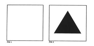
Compare this to figure 1, and figure 2. In figure 2 the
black area we can call the figure. The surrounding area,
the white area, we can call ground. We can now see the
relationship between figure and ground. Although they
both appear within the same square on the same level,
the black area seems closer to us. In most cases we will
see the shape of the black area first, if you look again
and look at the white area again first you'll see a white
area with a hole in it. When we take photographs we will
always have a figure and ground area. The stronger the
difference between the figure and the ground is the easier
it is for us to see the image. In photography we can use
contrasts, fine grain and similar effects to separate
the figure from the ground. If our image is very grainy,
low in contrast, we will not see easily what we have photographed.
But we have to go back first to what we see through the
viewfinder. We have a variety of possibilities to assist
us:
-
Focus. When we focus we can get
our figure sharp and the ground out of focus so we can
separate the two. When we are looking around ourselves
we will focus subconsciously on what we like to see.
For instance, you are walking in a busy street and you
could select easily one single person without walking
into a lamppost because everything else has suddenly
gone out of focus. Although some people might focus
too severely on one single person and ouch, this could
happen... but you know what I'm trying to say. I am
trying to tell you to focus on our black area in the
square, not on the square including the white ground.
Depth of field of course will control our figure that
we will see easily.
-
Lens position, or camera viewpoint.
Our camera position will dictate what we see and what
is behind or in front of our figure. Too often we are
mesmerised with what we see in front of us and instantaneously
bring that camera to our eye and take the photograph.
Do not. Move around in order to obtain the best possible
position of your figure and ground. How often have you
photographed something that later appeared to be glued
against something in the back, objects sticking out
from it, or something has come in front of it that we
did not "notice" before.
-
Light. Use the light to separate
the figure from the ground. Like in profiles, backlighting,
we can easily distinguish between figure and ground.
Light can highlight the texture and detail of the figure
as opposed to that of the ground.
- Filters and printing techniques are additional
tools we can use but not correct the mistakes if you forgot
any of the three must do's above.
When we look at the whole image as a whole, it is build
up from various components. It is those components that
will make your image. The way these components are placed
inside our image shape will control the effect they will
have, the whole is different then the sum of its components.
How we work our eyes and see the different components in
an image is dealt with in the Gestalt school of psychology.
Gestalt has developed principles that were primarily concerned
with the figure and ground relationships to help see objects
as a pattern or a good figure. This is psychologists speak
- engineers speak of signal to noise ratios and image makers
often refer to it as negative and positive space. When we
can utilize these principles it will make it easier to create
stronger images. Four of the main principles are:
- Proximity
- Similarity
- Continuity
- Closure
A sample of proximity is for instance a photo of "tree
planting of young pine trees". When these are close
enough to each other and all the trunks are straight an
upright, they will form a line, or give the impression of
a line of trees. The closer the trees are together the greater
is the probability that you will see them as a group or
a pattern or line. Two trees separated from each other for
some distance will not create that impression.
A sample of similarity occurs when your photograph two
or more items of similar shape within the frame. Because
you use similar shapes you view or see work easier, it
creates more impact because of the repetition of shape.
It does not necessarily have to be in similar shapes,
you can also use similarity as a symbol. For instance
if some lines in a photograph look very similar to a crucifix
you have a similarity.
A sample of continuity occurs when the visual elements
have very few interruptions so they seem to create a curve
or a line, like a river flowing through the image. If
you can visualize your visual components to create a line
your composition improves. Imagine you photograph some
products in such a way that they create a strong compositional
line your image may have more impact than if the products
were scattered around in your image. Proximity is important
in this case…
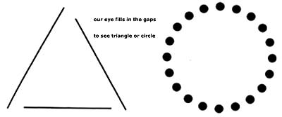
A sample of closure is when the visual lines that we
have created almost form a unit, like a pyramid, circle
or oblong box, or any other easily recognizable shape
that we can identify with by association. To leave a little
space just short of closing the shape of the pyramid or
box will create a dynamic, our eye will fill-in the gap
to complete the shape.

Or, imagine a close up of two pairs of lips kissing,
nothing else in sight, the critical space between the
two pairs is a most important dynamic, too close and too
far apart are not good, you have to find that magical
closure…that magic tension before passion breaks
loose…

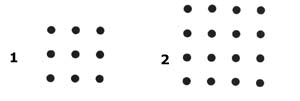
To kill some time and practice your visual thinking and
physical movement try to connect the nine dots with only
four straight lines. If that is too easy try to connect
the 16 dots with only 6 straight lines.
PS do you see a square or separate lines?
Feedback for more of this? Contact me with your view at:
hotshot@ihug.co.nz
Viewing you next time,
Robert A F van de Voort 2003
A Lens With a View
to View Articles
1 | 2
| 3
|


