A Lens with a view to view 3
by Robert A F van de Voort
"I shut my eyes in order to see"
- Paul Gauguin
Once we have started to analyse the content of our proposed image
a little bit more there are some visual effects that we take for
granted, or we are not aware of them. In my previous articles
I have mentioned quite a few elements we can look out for or use
their characteristics (like colour) to enhance our images.
There are some other obvious laws at play that we do not even
think of, or at least I do not think of them. Like the contrast
of light against dark or dark against light.
In most cases I just take for granted the effect they have, but
if I think about it, did I use my contrasts correctly (and see
the remarks below) and would I photograph next time a different
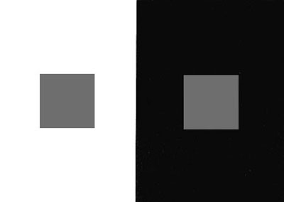
way? For instance the contrast of grey against white, or grey
against black, which grey would appear in your eyes to be lighter
or darker? (without looking at the sample image a little further).
I'll think this is an easy one, against a light colour a grey
tone will appear

Careful placing of your tonal values in your images will have
a different perceptual effect.
Did you know that a brighter part of your image can give the
impression to be closer to us then a darker area? The image has
to be created with this concept in mind

In a similar manner you will probably have experienced the fact
that when you take a photograph of some hills in the distance
that are covered in mist or fog they seem to be quite far away.
Once the mist clears and we can see the hills in the distance
clearly they seem to be closer to us. The contrast is higher when
there is no mist or fog, because of the increased contrast we
tend to assume the objects or landscape is closer to us.
Do we use these ideas to set up our shots when we photograph
commercial images?
In most cases I feel it is an automatic function.
On another note, a more personal note, the viewing distance of
our images is quite important.
As a general rule of thumb we should look at images on a distance
of twice the diagonal of the image we are looking at. So if your
images are on average 10 by 12 cm, or four by five inches The
viewing distance should be 12 inches approximately or 30 cm. Which
is probably quite close to the average reading distance of a magazine
or book.
If we know what the average distance is that the viewer will
look at our image we can design the photograph. We create the
impact that we want to deliver with that image for the viewer
to experience. Size is important…J!
If you like to create a very intimate look or feel when you create
portrait photography you have to think of the end result. Where
and how is the image displayed? If the photograph is displayed
on a wall for everybody to see the viewing distance will be different
compared to a page in a magazine or book.
I must explain what I mean by any intimate look or feel, and
I go back to the start of the photo session in the studio.
When we communicate with other people we have a certain distance
from each other in which we communicate. An acceptable social
distance between European people is probably about 1.5 m or 2
m away from each other. If you were to approach the other person
very close and start talking to them at a distance of about 50
cm away from their face, you both probably would be feeling very
uncomfortable. Each human being has a certain amount of space
around them that is their personal private space, we should not
enter that on a social basis. Different cultures, different people
and different situations will influence the distance that we will
feel comfortable with. The intimate personal area around a human
being is probably less than 70 cm. If we look at each other from
within that distance the size of the face is quite big. If two
people meet and are madly in love with each other they might be
very close to each other at certain times. If they look at each
other from such a close proximity, say 20 cms, their face probably
will be so large that they can just see the whole face, quite
likely they are able to focus on the eyes or... and the rest is
all visible by peripheral vision, not sharp but recognisable.
This is what I mean by an intimate look or feel. I am not saying
this is the only way to create that look, after all we are photographers
and have various ways and means to convey emotions, feelings and
intimacy. In order to recreate that intimate feel the photograph
has to have a certain size to reflect the original combination
of intimacy if you were so close to each other. I would say the
portrait should be life-size or bigger when viewed from a close
distance, like a book on magazine. I will not ask my editor Brian
Curtis to give me a full page photograph to prove my point…The
same size photograph would not create that intimate feel when
it is hung on a wall in an exhibitionhall where the public can
only view the image from a distance of 3 m. or more. In that case
the image has to be approx 6 m high to have a similar effect.
At the moment I am just applying the rule of thumb, I am not
saying this is the only way to work. I am using these two extreme
suggestions to show that the size of the photograph is important
when you consider where it is seen and what the viewer can or
should experience when they see it.
If you printed the same photograph very small you invited the
viewer to come very close to see detail -Thus it could become
quite intimate.
I have read that the ultimate intimate space of a photograph
is in a publication when the viewer will actually make page contact
with the photograph like in a "scratch and sniff" perfume
invitation.
Personal space exists in the studio when we take the photographs.
We are told "don't touch the model" because that way
we can enter the models personal space. This cliche is not always
valid, it depends on the situation and understanding between photographer
and client. We can avoid entering the model or clients personal
space by using a longer lens. That way we can get the intimate
look and feel without invading personal space.
Viewing you from a distance (outside tomato range…)
For feedback, express your view - contact me at hotshot@ihug.co.nz
Viewing you next time,
Robert A F van de Voort
A Lens With a View to View
Articles
1
| 2
| 3
About the author:
 Robert van de
Voort is a professional photographer and writer, with his headquarters
located on the North Island of New Zealand. Robert's professional
photographic career spans the course of over 20 years, with
work in stock, advertising, studio, digital photography and
much more! You can learn more about Robert and see examples
of his stunning work by visiting his website at www.AlbanyStudios.co.nz.


