The Zone System - Part Three
Contrast
(by Lars Kjellberg)
By Lars Kjellberg The obvious difference between colour prints
and black and white prints is that the black and white prints
have no colours. Colour as a medium of information is very important
in colour prints, so to compensate for this in black and white
photography we have to be much more aware of the problems of working
with a grey scale. The grey scale is the black and white print's
'colour', the most important provider of information, and in order
to master the grey scale we must control the contrast.
Fortunately it is much easier to control the contrast in black
and white film than it is in colour. All negative colour films
are developed to the same contrast, and generally there is only
one contrast grade of colour paper. Slides are also developed
to the same contrast. The most important way of limiting contrast
in colour pictures is to pre-expose (or post-expose) the film
slightly, which will decrease contrast in the darkest areas.
Even though we hardly ever do anything about the contrast in
colour prints, most of the time we still accept them as good pictures.
Black and White Contrast
When you work with black and white there are many ways
of controlling the contrast. The most common is to use a different
grade of paper or to filter a variable contrast (VC) paper.
Most people working with black and white follow one set of instructions,
and hardly ever change the development time. Development time
is in fact an excellent tool for controlling the contrast in black
and white film. Shorter development times give you a low contrast
negative and longer times give you a high contrast negative.
As with colour film, you can also decrease the contrast by slightly
pre-exposing the film before use. This can also be done to the
paper while printing. Pre-exposing the paper decreases the contrast.
These different methods of controlling the contrast affect the
final photograph in various ways. An alteration in the development
time changes the contrast evenly. A strongly reduced development
time may make even the darkest shadows disappear, something that
has to be compensated for by increasing the exposure.
Different paper grades also affect the whole tonal scale more
or less evenly. If you are forced to use a really high contrast
paper (Grade 4 or more) the detail in the darkest shadows and
brightest highlights may be lost. VC papers will not give you
as even a change in contrast as graded papers, although it should
be noted that some VC papers will have a more even effect than
others.
Pre-exposing the film reduces the contrast only in the darkest
shadows, while pre-exposing the paper reduces the contrast in
the brightest highlights.
Aim to Use a Normal Paper
In his final version of 'The Negative', Adams recommended
using the film development time to control contrast, but he also
warned against becoming obsessive about it. Despite all claims
to the contrary by many zone system experts, the idea is to be
able to print every negative on a normal paper. According to Adams,
you should try to find a development time that works with Grade
2 paper, but that said, having to use a Grade 1 or Grade 3 paper
is not a disaster. The reason for aiming to use Grade 2 paper
is that you can then use Grade 1 or Grade 3 if you have to. If
you set out to use a Grade 3 paper you may end up having to use
Grade 4, loosing shadow and highlight contrast in the process.
Which Contrast?
There are many reasons why you should vary the contrast
when making black and white prints. The contrast inherent in the
object varies. Soft light that casts no shadows requires a negative
or paper with a high contrast. Harsh light creates pictures with
too much contrast if not compensated for by a low contrast negative
or paper.
Some objects do best with less contrast, others need more if they
are to come out well in the final print. Tastes differ. Some people
prefer soft pictures, others prefer them with a higher contrast.
Before we go further into the zone system's method of contrast
control, and the terms used to describe this, we will take a closer
look at the zone scale and the different zones.
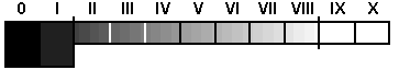
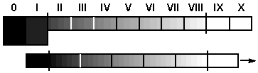
A schematic picture of a zone scale from 0 to X.
The border between black and almost black is marked between
zone I and II (zone I 1/2). The border between white and almost
white is between zone VIII and IX (zone VIII 1/2).
Blackpoint and Whitepoint
There are two very important points indicated on the
zone scale shown in the figure the blackpoint and the whitepoint.
The blackpoint comes between Zones I and II, and the whitepoint
between Zones VIII and IX.
The blackpoint is the point where totally black becomes nearly
black. Details that are exposed so they fall into a zone beneath
Zone I 1/2 will be more or less absent from the negative, and
the print will be wholly black and devoid of all detail. Details
exposed in Zone I 1/2 and up will appear on the negative.
At the other end of the scale, details exposed beyond the whitepoint
at Zone VIII 1/2 will come out totally white in the print if we
do not do something lower the contrast. Unlike those at or beyond
the blackpoint, these details are present on the negative, and
by choosing a low contrast paper or by using post-exposure we
can make these details appear in the print.
The Different Zones
Zones 0 and I will always appear totally black when printed.
Occasionally you may be able to obtain some tone in Zone I, principally
if you have used a short-toed film and paper with a short shoulder.
Zone II will be distinguishable from totally black on the negative
and the paper. Very dark details in shadow should be exposed in
this zone.
Zone III shows distinct texture.
Zone IV will be slightly darker than medium grey. Skin tones
in shadow and dark foliage are suited to this zone.
Zone V is the one to which exposure meters are adjusted. The
intent is to make Zone V appear medium grey in the finished picture.
Since the choice of film and paper affects the tone, do not try
to follow the grey card too closely when printing Zone V.
Zone VI is light grey. Well-lit pale skin tones come out best
in this zone, as do snow and white sand in shadow.
Zone VII approaches white, but can reproduce detail with distinct
texture.
Zone VIII is almost completely white.
Zones IX and X are usually completely white. Using a softer paper,
shorter development time or post-exposure when printing, we may
be able to make even these zones appear in the final print.
Zone Placement
When using the zone system to decide upon the exposure
and development, you normally use a type of exposure meter called
a spot meter. This measures the light for only a very limited
area of the object. Many modern cameras have a built in spot meter
that can be used for this purpose. You take a selective measurement
of a small part of the object.
However, before you measure the exposure, you have to consider
how you want the different details of the object to appear in
the finished picture. The best way is to look for details that
will be reproduced as relatively dark in the picture.
Say we start by finding a detail we will want reproduced in Zone
III. We want it to appear as very dark in the picture, but we
also want to maintain its texture. Point the spot meter at this
area and take a measurement. Since the meter will always want
the exposure to be in Zone V (making everything medium grey),
the exposure has to be adjusted to Zone III. Since Zone III is
two stops darker than Zone V, we will have to reduce the exposure
by using a smaller aperture or a faster shutter speed. If the
meter suggests f8 and 1/30 seconds (8/30), we can choose to use
8/125 to get an exposure in Zone III. We will set the camera to
8/125 when we photograph the object. To use zone system terminology,
we say that we placed the detail in Zone III.
When the placement - and thus the decision on the whole exposure
- has been made, the next job is to check where the remainder
of the object details fall. All this really means is that we check
the contrast. Point the spot meter at the brightest area on the
object and read off the value. Calculate how many stops brighter
than Zone III it is. Take the difference and add three (since
the placement was made in Zone III) and you will know which zone
the brighter detail falls into. For example, if the reading for
the bright area is 8/1000, it is five stops brighter than the
dark area we measured first (the difference between 8/30 and 8/1000).
5 + 3 = 8, thus the bright are falls into Zone VIII, which will
be almost completely white in the finished picture.
Normal Development
The zone system uses the terms plus, normal, and minus
development. Normal development is used when you are satisfied
with the zones the different areas of the object fall into. If,
in our example, we were happy for the bright area to fall into
Zone VIII, we can develop as normal. Normal development produces
a good average contrast suitable for pictures taken in light that
is neither unnaturally soft nor harsh.
What constitutes a normal development time is decided by calibration
or experience. We will take a closer look at calibration in Part
Four.
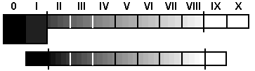
Normal development. The contrast of the object corresponds
with the zone scale. We are content with the result and do not
have to adjust the development.
Minus Development
If, on the other hand, we are not satisfied with the
way the other details fall, we will have to adjust the contrast.
Assume that we do not want the bright area to fall into Zone VIII
as being too white, and that we would prefer to have it in Zone
VII. If this is the case, we want to reduce the picture's contrast.
To do this we use minus development, and since we want to adjust
the detail down one stop, we do a minus 1 development. We could
also achieve the same reduction by printing onto a softer paper.
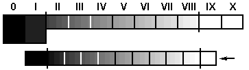
Minus development. The contrast of the object do
not corresponds with the zone scale. The contrast is too high
and needs to be reduced. Zone VIII in the object has to be moved
down to zone VII on the scale. We will have to reduce the development.
A minus 1 development is a proper development in this case.
Plus Development
Equally well, we can find ourselves in a situation where
we need to increase the contrast. Perhaps the light when we took
the picture gave too low a contrast, leaving us with soft negatives
and pictures as a result. Alternatively, the contrast in the picture
is low simply because the object was low-contrast.
You will notice this when you measure the object with a spot
meter. The exposure is chosen by measuring the darkest parts of
the object, and placing the dark detail in the corresponding zone.
When we measure the other details we may discover that they fall
in too low a zone, resulting in a low-contrast picture. If, for
example, we want to move a detail from Zone VI to Zone VIII, it
means a two-stop move, and thus a plus 2 development. Later, we
will take a closer look at how you calibrate exposure and development
more precisely.
Plus development. In this case we are going to move
zone VI in the object, up to zone VIII, in order to get the
result we have visualized. Two stops up calls for a plus 2 development.
A ready reckoner for contrast control
| Object
Light Contrast |
Diffusion
enlarger |
Condenser
enlarger |
| Low |
Plus 15% development
Or use grad 3 paper |
Recommended development |
| Medium |
Recommended development |
15% less development
Or use grad 1 paper |
| High |
15% less developmen
Or use grad 1 paper |
30% less development
Or use grad 0 paper |
Error processing SSI file
You can see more articles and information
by Lars Kjellberg on the Photodo.com website - a great resource
for photographers around the world!